Services provided:
- Web design & development
- Hosting
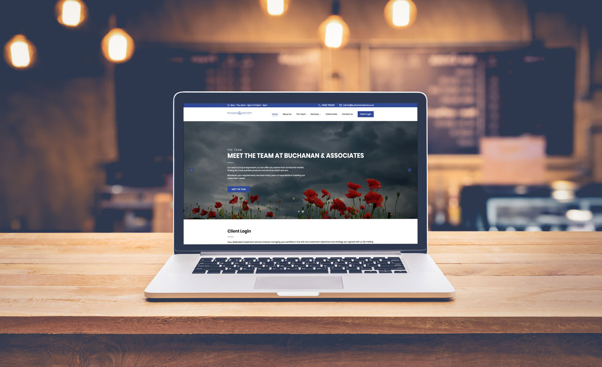
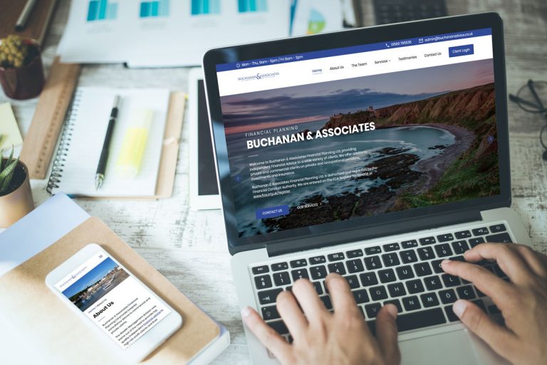
Buchanan & Associates Financial Planning Ltd approached us to create a new website for their financial planning business based in Stonehaven. The website they had previously was a little out of date and was difficult to update the text and images. It was also not mobile responsive, so was a bit of a difficult experience to view on a mobile device.
Therefore they wanted us to create a website that would solve these two points as well as showcase the services that they offer and provide users with easy access to contact details for making enquiries.
The website was built on WordPress as a bespoke theme, which allowed us to make use of it’s powerful content management system. This means it is very easy and user friendly for our client to login to the admin page and make changes to the text and images throughout the website and have those changes take immediate effect on the live website.
As we developed the website we payed attention to the different screen size breakpoints, meaning that the website displays well at all screen sizes and is very mobile friendly. So we suggest taking a look at the website on both desktop and mobile screens to see how they compare.
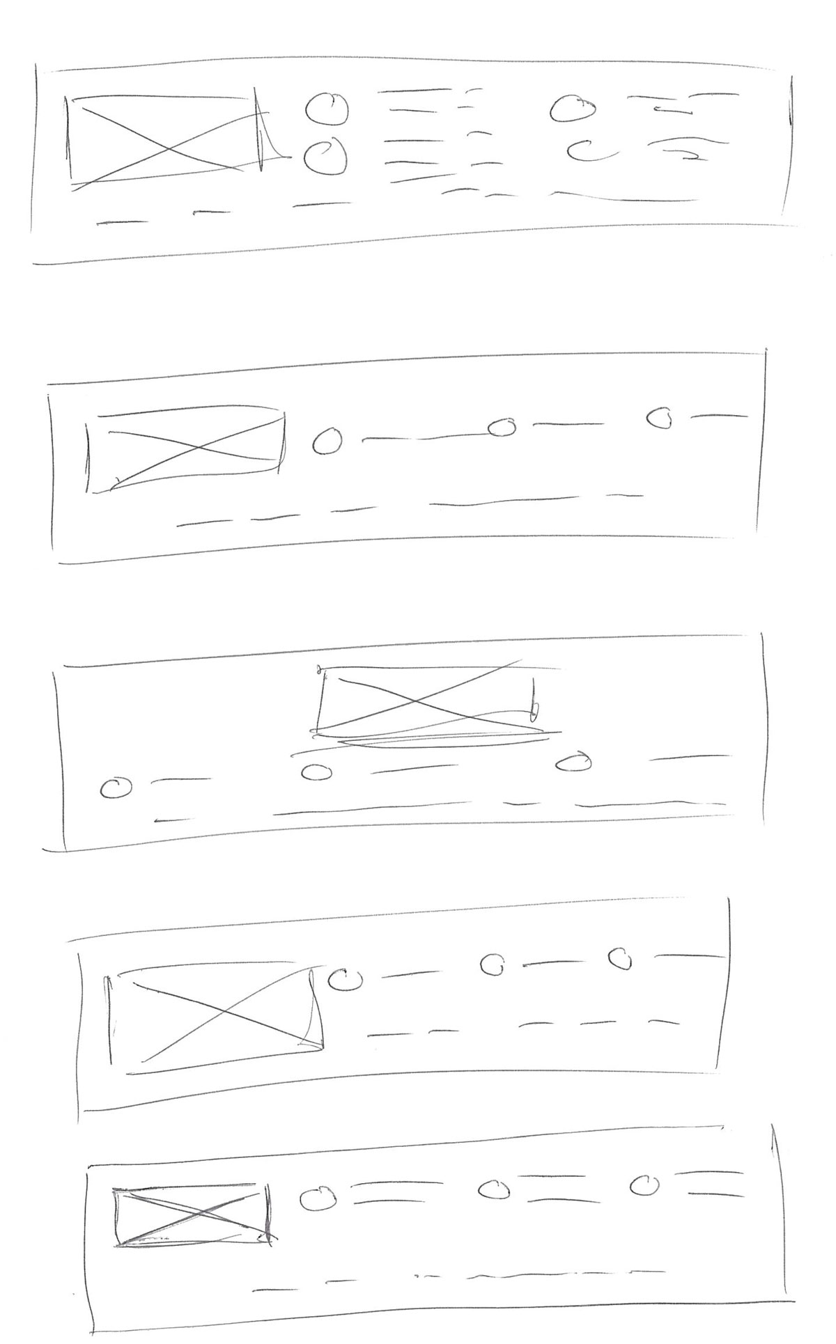
Header Section
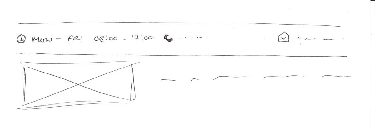
We initially worked on the layout required for the header of the website to ensure that all the essential contact information and navigation items could be displayed clearly.
We went through an iteration of layouts for the header before landing on the sketch below, which was then used as a basis to create a digital wireframe.
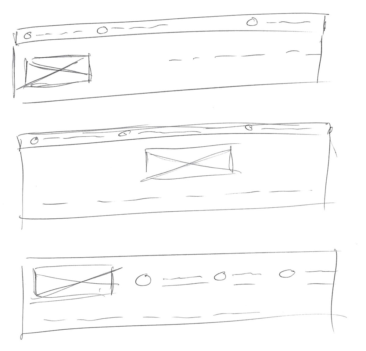
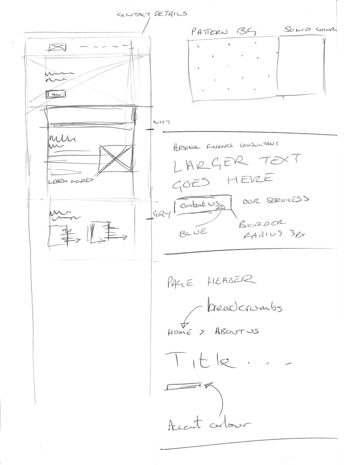
Homepage
Once the header for the website was established we continued on with the homepage to flesh out the major areas that would be showcased. A few notes were also made as reminders for some potential design accents and attributes that some of the elements of the finished website would feature.
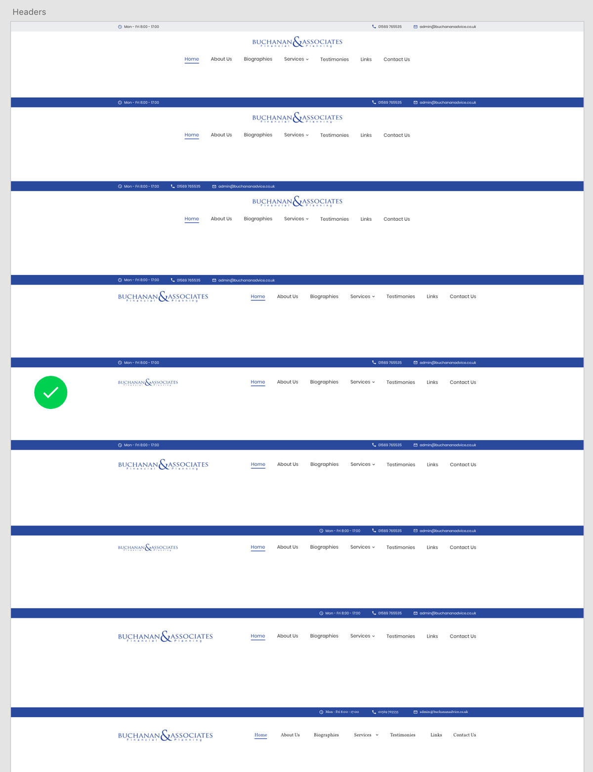
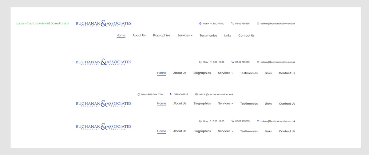
Design of the header
Although the sketch gave us a fairly good direction to follow for the header section of the website, quite a lot of time was then spent in graphics software (Adobe Xd) coming up with alternate arrangements of elements and information.
It was also at this stage we started to introduce colour to provide accents and bring focus to certain elements. Different fonts were also tried just to see if it had a different effect.
The layout we settled on had the best spacing of elements to provide clarity of the different contact details as well as the website navigation.
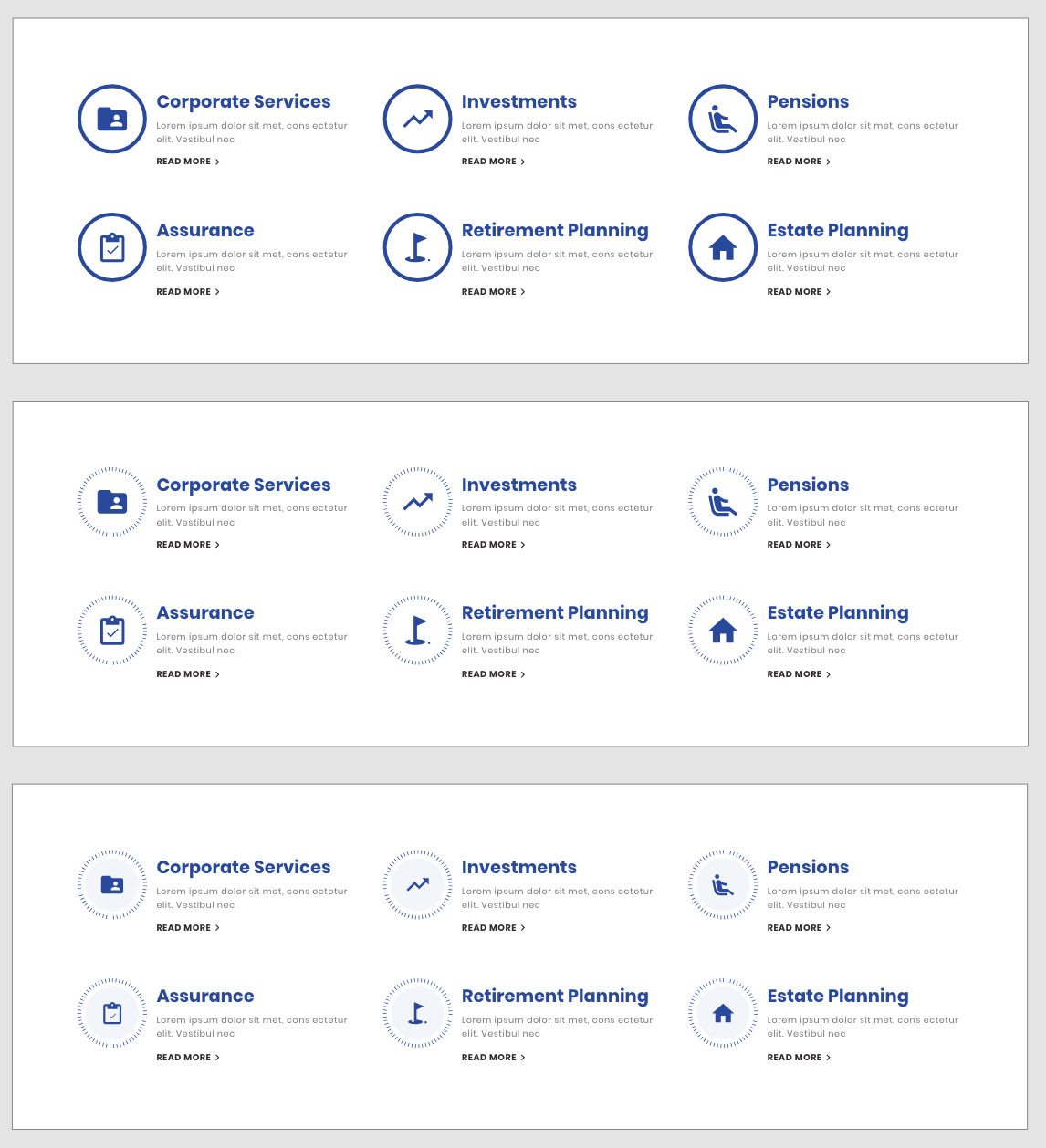
Design of services section
Another area that had quite a lot of iteration was the services section. The initial layout of the services was good and clear, but we made some changes to make the layout more unique.
We changed the thick circles around the icons to a more stylised dashed line before adding a subtle background colour to complete the design of this section.
Some of the styles that were developed in this section gave the website a bit of a new look and style and, for this reason, we decided to repeat these new styles throughout the website to give it more consistency and a branded look.
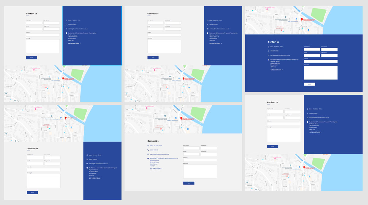
Design of the footer
The final section that went through a bit of extended iteration was the layout of the footer and contact elements.
The Finished Product